
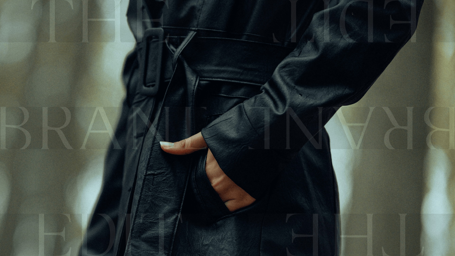
FOR RIGHT NOW…NOT SOMEDAY
Look like where you’re headed, not where you’ve been
A fast, designer-guided visual reset for the business that’s outgrown DIY but isn’t ready for the full brand overhaul yet.
YOU KNOW THE FEELING
Someone asks for your website mid-conversation, and there’s a half-second flinch before you send it
It’s not bad. It’s just behind. And “behind” is quietly doing damage you can’t fully see.
The client who almost booked and didn’t. The referral who Googled you first and hesitated. The rate increase you haven’t pushed through because the brand doesn’t back it up yet.
Not quite custom. Definitely not a template.
You need your brand to catch up
A full rebrand is the right call for some businesses. It’s not the right call for all of them, and it’s definitely not the right call for right now if what’s actually missing is consistency, not clarity.
The Brand Edit exists for exactly that gap: a fast, designer-guided visual reset that gets your brand current…without the multi-week custom process, and without the price tag that comes with it.
This is for you if:
✓
You’ve outgrown the DIY version of your brand, but you’re not ready for a full custom brand experience
Your work and your rates have moved on, and your visuals haven’t caught up
You want something polished and cohesive fast — not a months-long process
You’re comfortable choosing a strong, designer-built direction and refining it, rather than building something from a blank page
This probably isn’t for you if:
✗
Your issue is positioning or strategy, not visuals — that’s custom branding’s job, not this one
You want a fully custom identity built around your business from scratch, with no starting direction
You’re looking for multiple rounds of revisions or a longer collaborative design process
You want a full brand system with templates, additional brand assets, and collateral pieces provided
By the end of the week, you’ll have a brand that finally looks like it belongs to the business you’re actually running:
A cohesive logo suite, color palette, and typography system you can put in front of anyone without a caveat
Launch graphics ready to announce the new look
Final files, ready to use immediately across print and digital
A brand that matches the level you’re already operating at — so the next referral doesn’t have to take your word for it

How it works
01/ Choose Your Style
Every Edit begins with one of three curated directions — each with its own aesthetic, personality, and point of view already built in.
02/ Customize & refine
A short guided questionnaire tells me what I need to know about your business. From there, I refine the logo, font, and color choices to fit. You choose the final version of each.
03/ launch
One week later, you have a refined, ready-to-use brand — polished enough to stop apologizing for your visuals.
creative direction 01
The Minimalist
TIMELESS

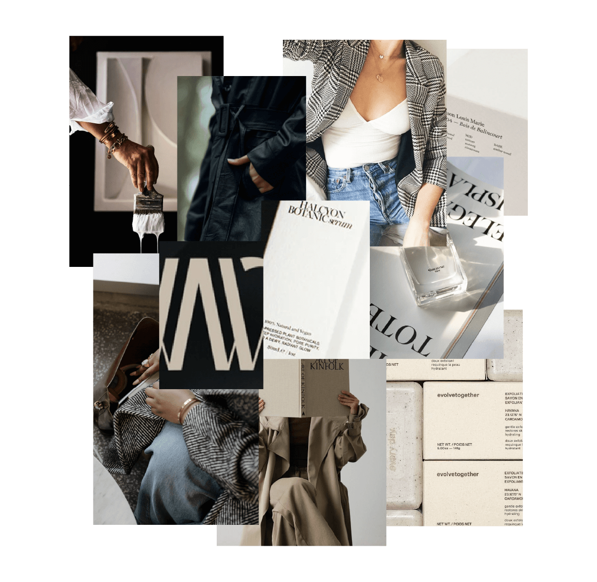
Refined. Timeless. Effortlessly elevated.
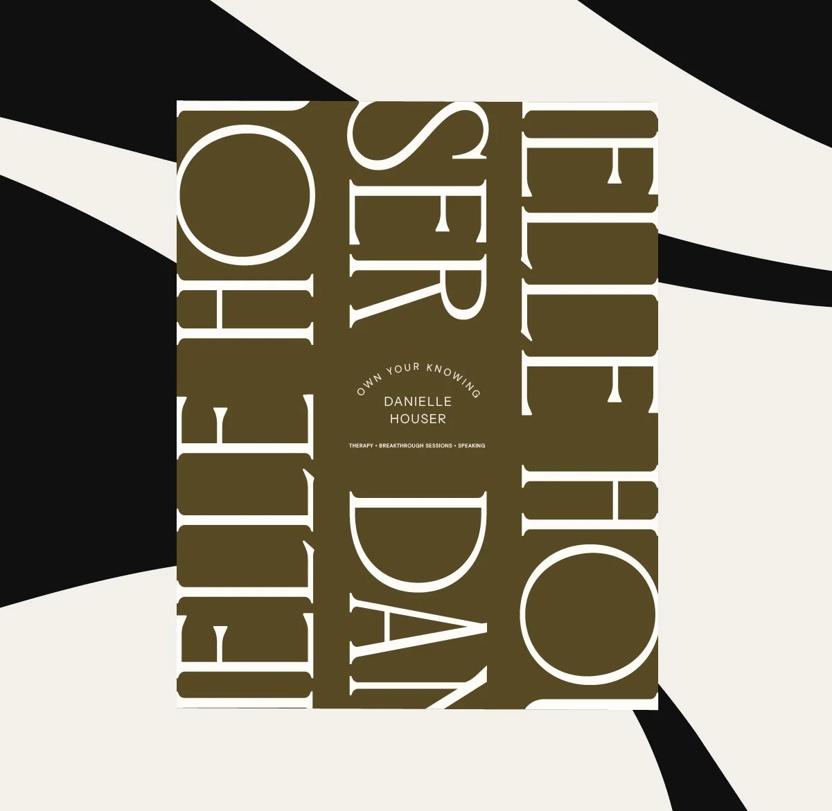
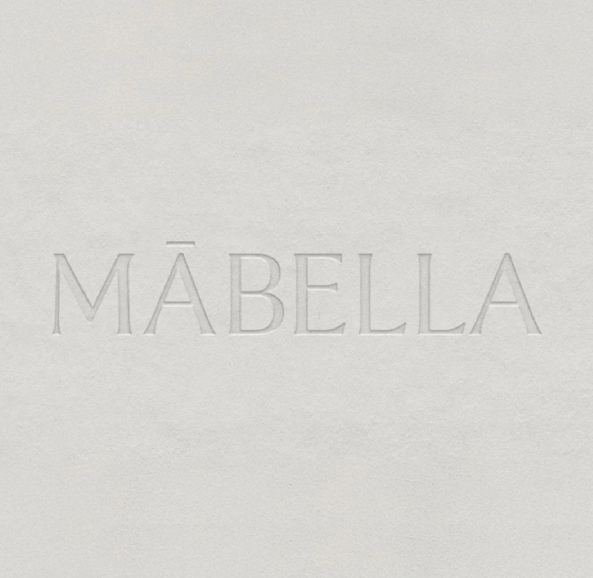
For the founder who believes less truly is more. The Minimalist direction leans into simplicity done well. Crisp lines, intentional spacing, and a refined aesthetic that feels effortless (because it is). This style creates a calm, elevated presence that instantly communicates clarity and professionalism. With versatile layouts and timeless type choices, your brand maintains consistency across platforms while feeling modern, polished, and unmistakably aligned with where your business is heading.
the design foundation:
Sans-serif logo with timeless, serif-forward typography
Clean layouts with intentional whitespace
Neutral or monochrome color palette for a polished, modern feel
creative direction 02
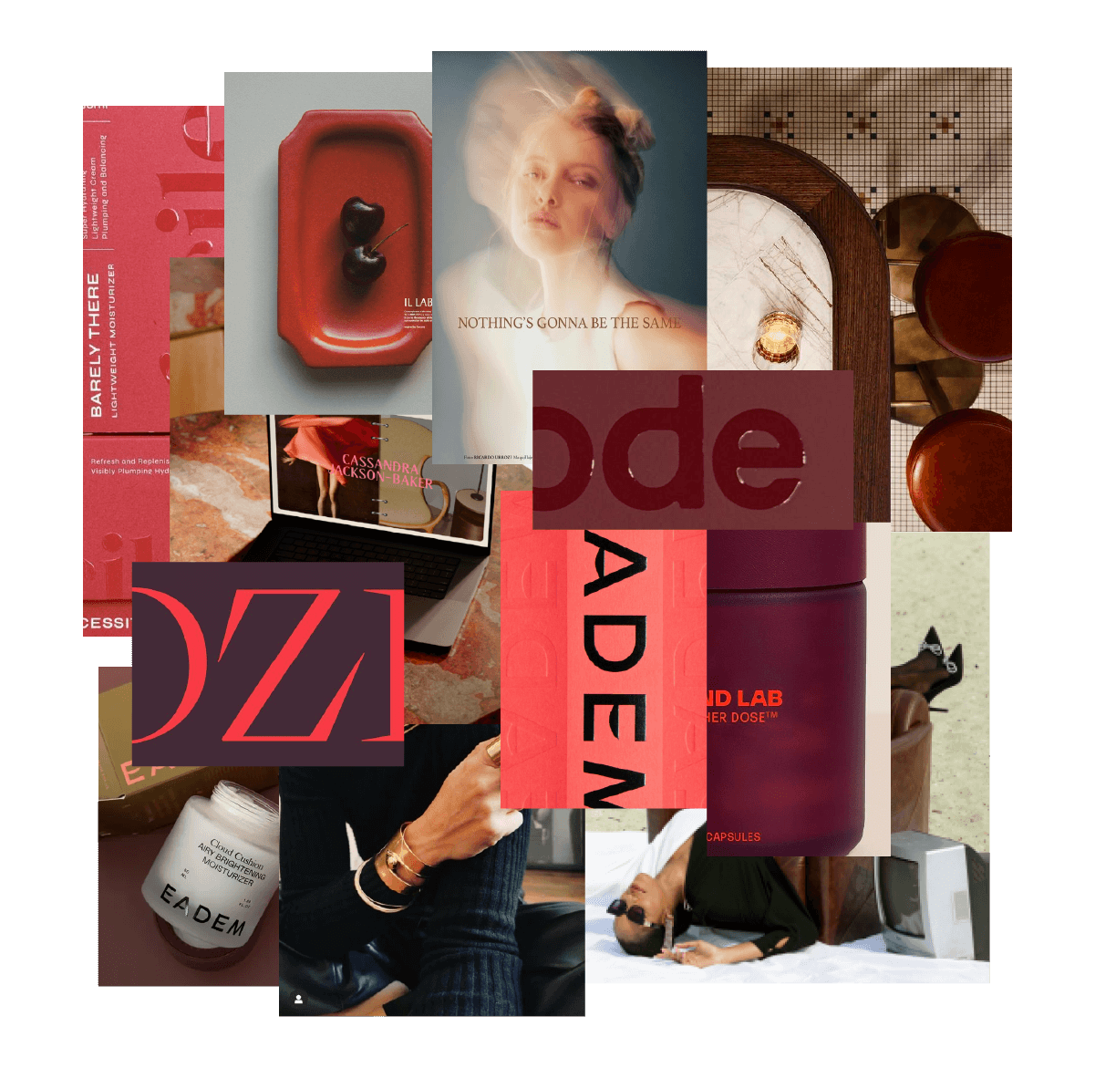
The Curator
EDITORIAL
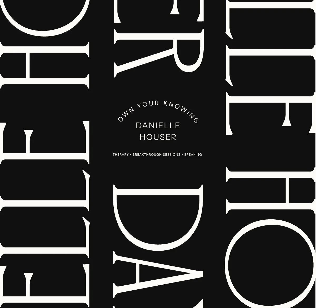
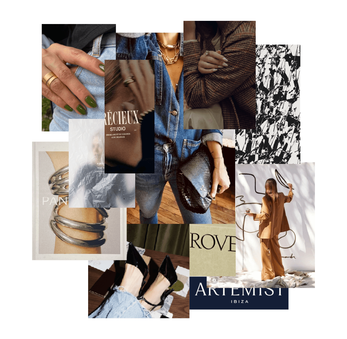
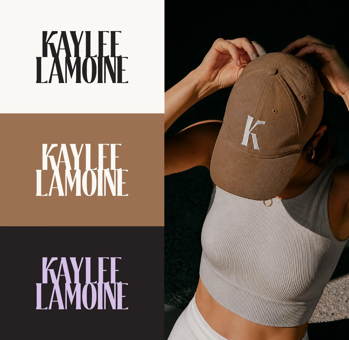
Editorial. Sophisticated. Intentionally crafted.
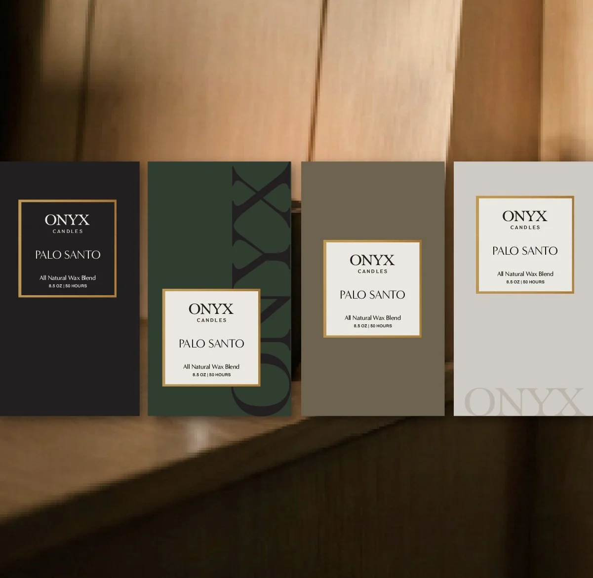
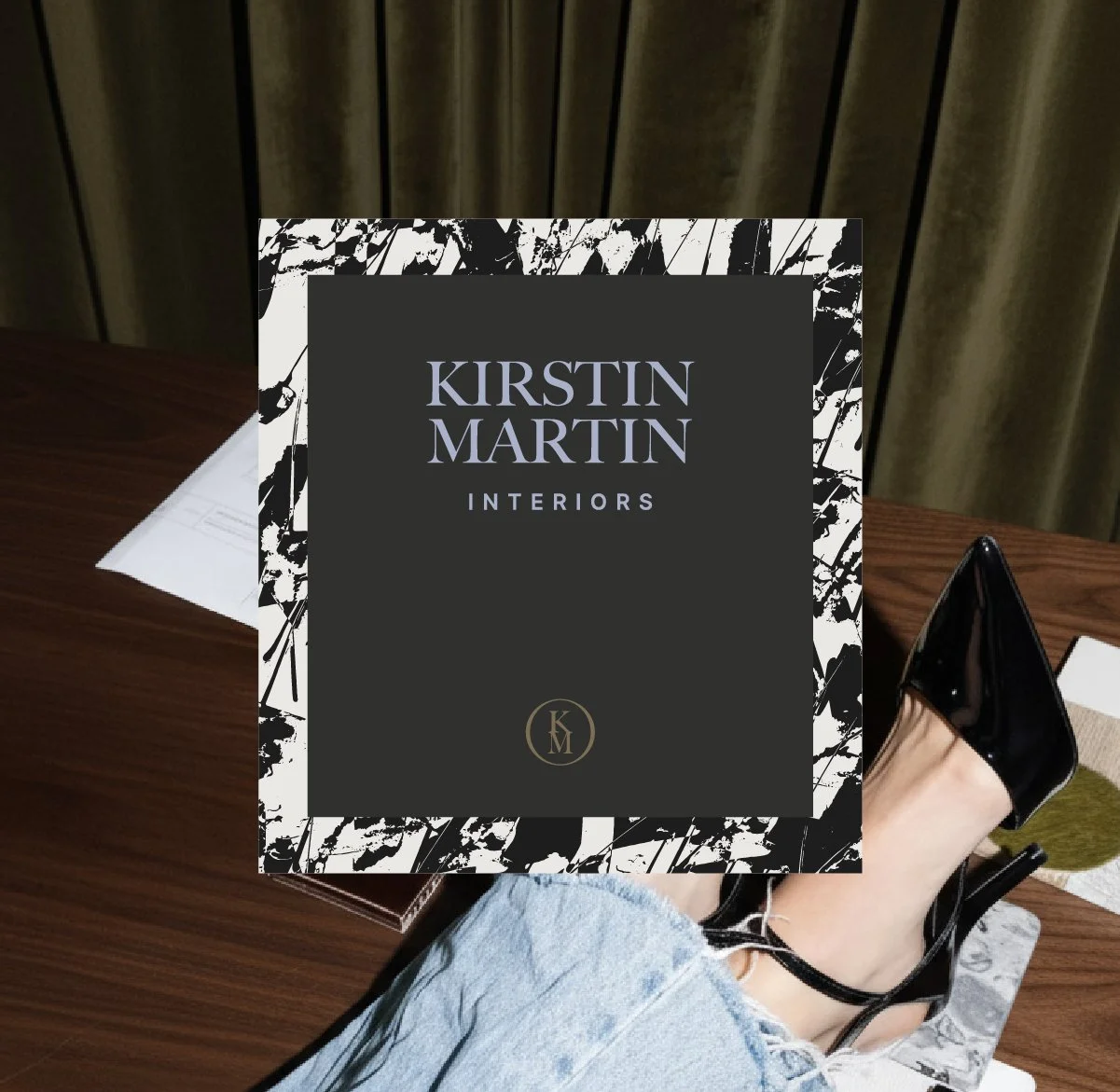
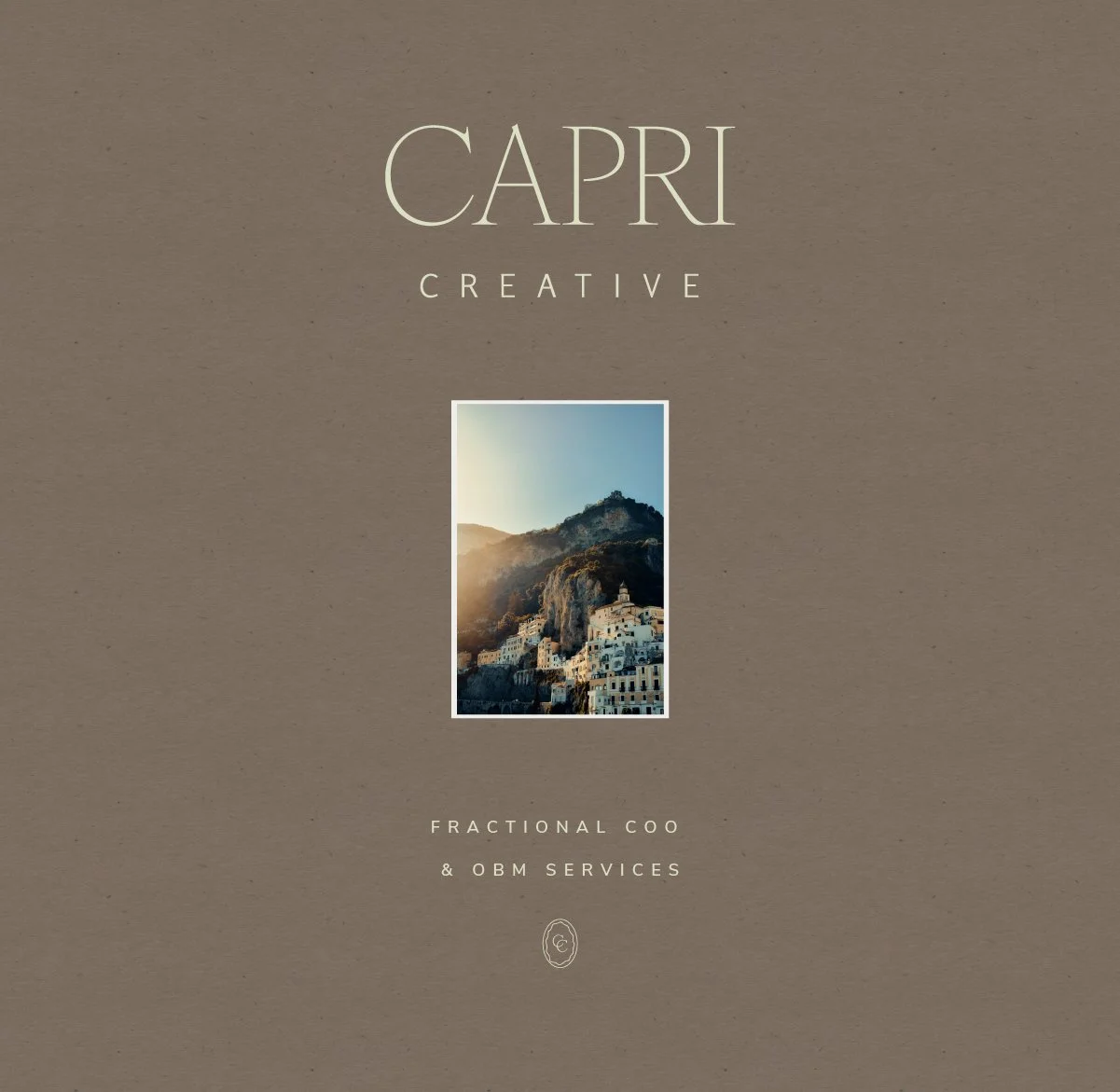
For the founder with a discerning eye and creative intellect. The Curator direction blends timeless design with warm, editorial details that give your brand depth and personality. Think thoughtful typography, balanced compositions, and visual elements that feel handpicked rather than mass-produced. This style is perfect for founders who want a brand that feels high-end yet deeply personal — a presence that’s refined, intentional, and rooted in artistry.
the design foundation:
Serif logo and bold, editorial typography
Striking contrasts and artful details
Stylish visuals with a refined, curated look
creative direction 03
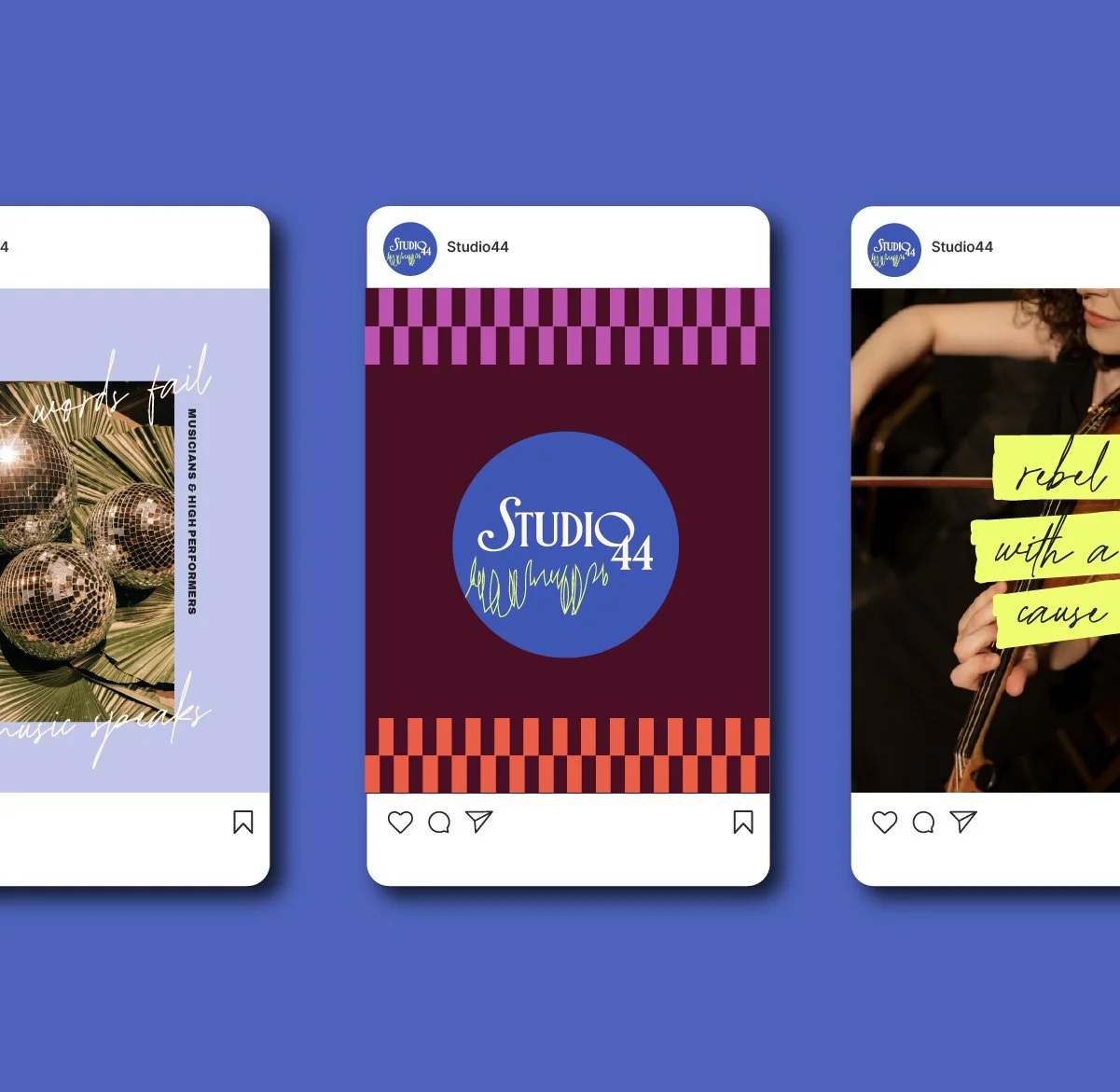
The Muse
BOLD
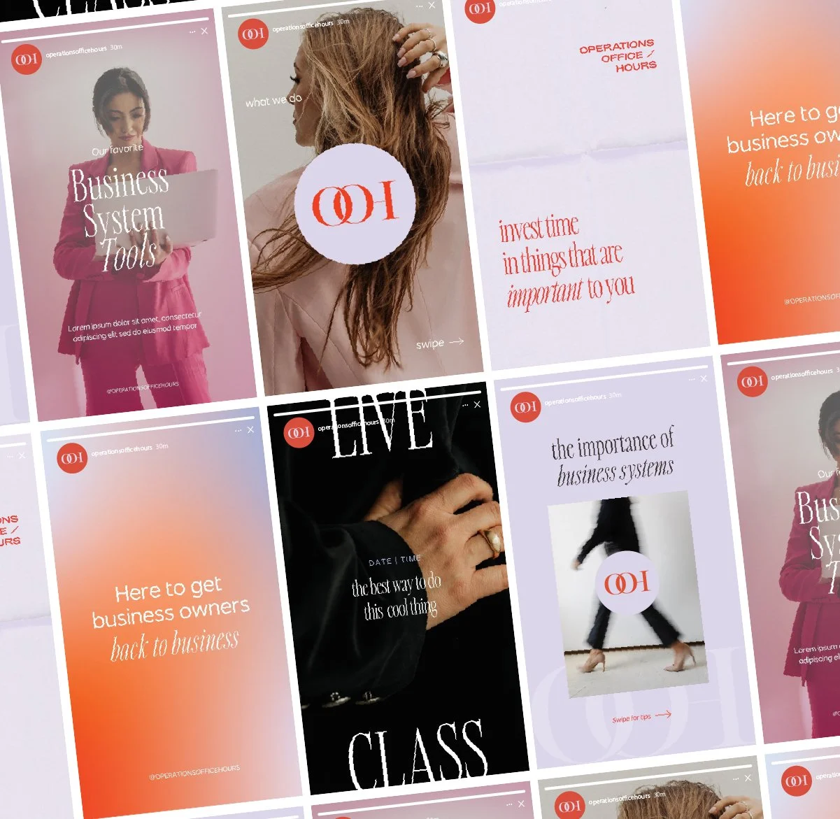
Bold. Colorful. Playfully elegant.
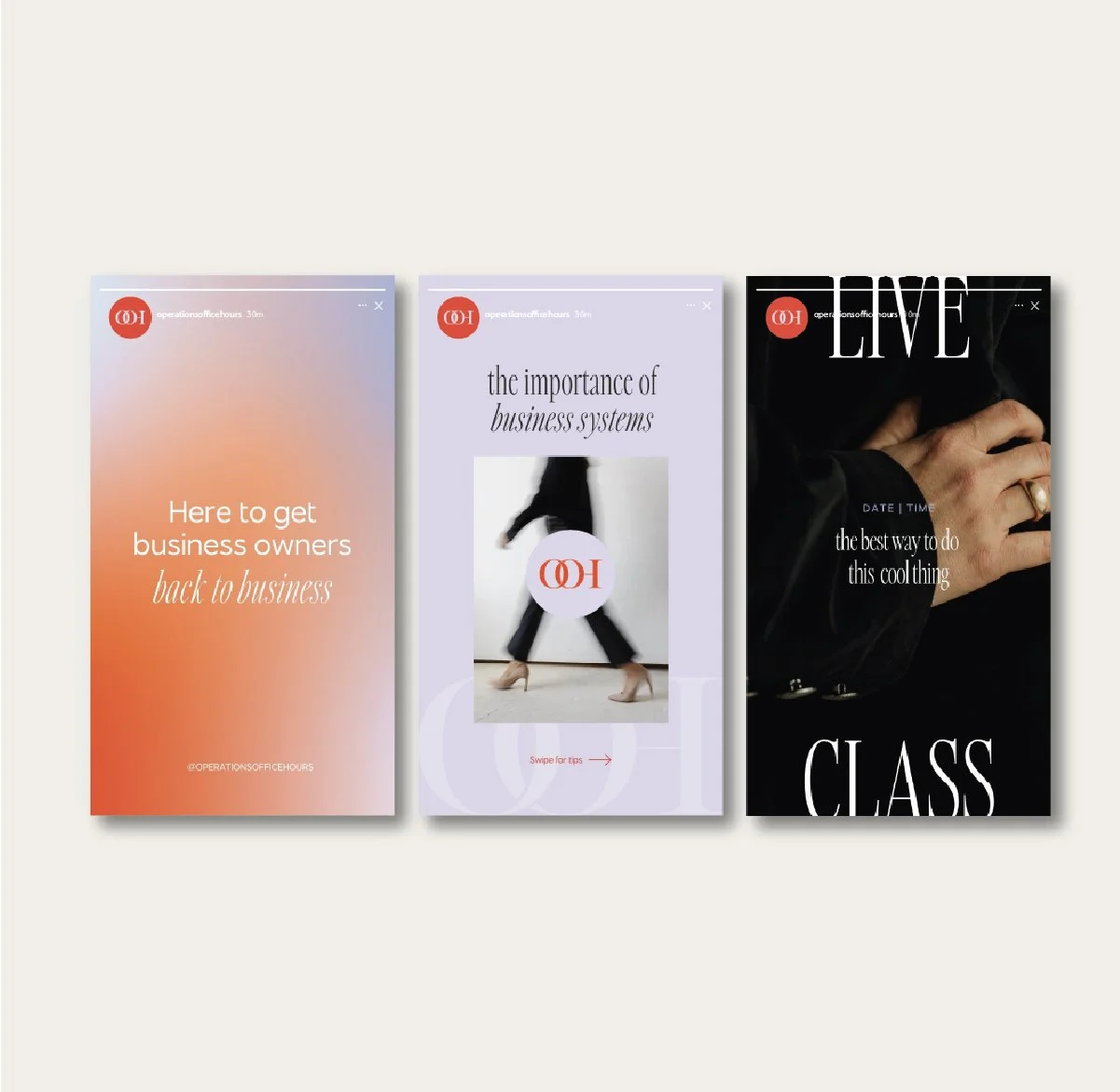
For the founder who leads with creativity and isn’t afraid to stand out. The Muse direction embraces vibrant color stories, playful accents, and dynamic layouts that make your brand feel alive. With unexpected pairings and compositions, this style brings a fresh, contemporary edge without sacrificing polish. It’s ideal for founders ready to step into their next level with confidence through a brand that’s modern, magnetic, and impossible to overlook.
the design foundation:
Stylized wordmark logo with sleek type pairings
Bold color stories and playful, layered visuals
Dynamic layouts that feel vibrant, bold, and expressive
-
![Four boxes of Onyx Palo Santo candles with different packaging designs placed on a wooden surface.]()
The Curator
-
![]()
The Curator
-
![]()
The Curator
-
![A sign reading 'Kirstin Martin Interiors' placed on a wooden table. A person's leg and foot in a black high heel shoe are visible, along with an open planner or notebook, a paper, and some clothing or fabric. The background has curtains.]()
The Curator
-
![]()
The Minimalist
-
![Cover design with the text 'CAPRI CREATIVE' and a photo of a hillside town with white buildings and a mountainous backdrop.]()
The Curator
-
![Three vertical social media story posts with a red logo in the top left corner. The first has a gradient background from peach to lavender with white and orange text about getting business owners back to business. The second has a light purple background with text about business systems, and a photo of a woman walking in heels with the logo overlaid. The third shows a close-up of a hand with a ring, dark background, white and black text about doing cool clothing, with the word "LIVE" and "CLASS".]()
The Muse
-
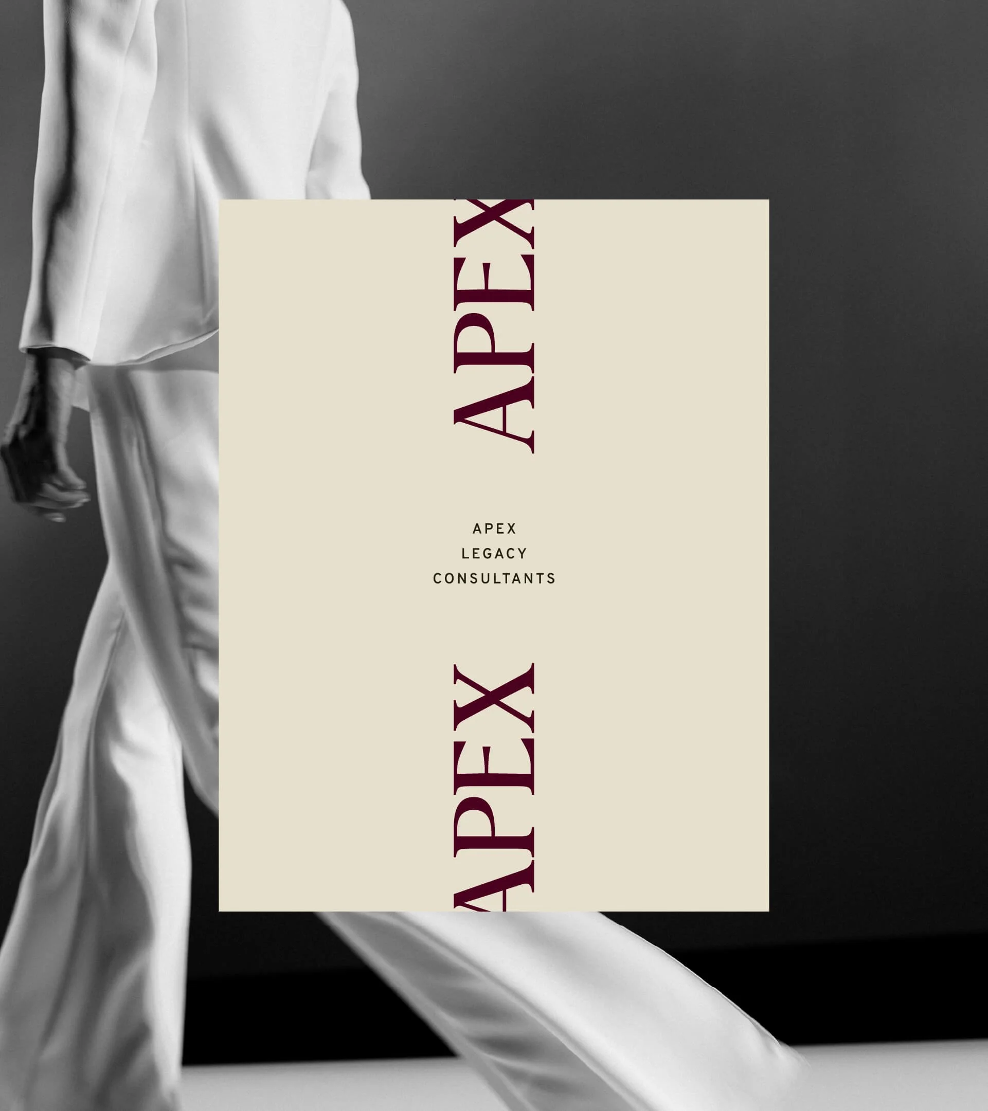
![A black and white photograph of a person in a flowing white outfit walking, with a beige sign in the center that reads "APEX LEGACY CONSULTANTS" and a circular logo in the upper right corner with similar text.]()
The Curator
-
![Laptop displaying a website for a web development studio called CODE Studio, with services like web development, Shopify setup and dev, and web support, placed on a beige upholstered surface.]()
The Muse
-
![Collage of restaurant promotional images featuring food and drinks, including desserts, appetizers, cocktails, and plates of food, with text promoting a summer patio event and restaurant name.]()
The Muse
-
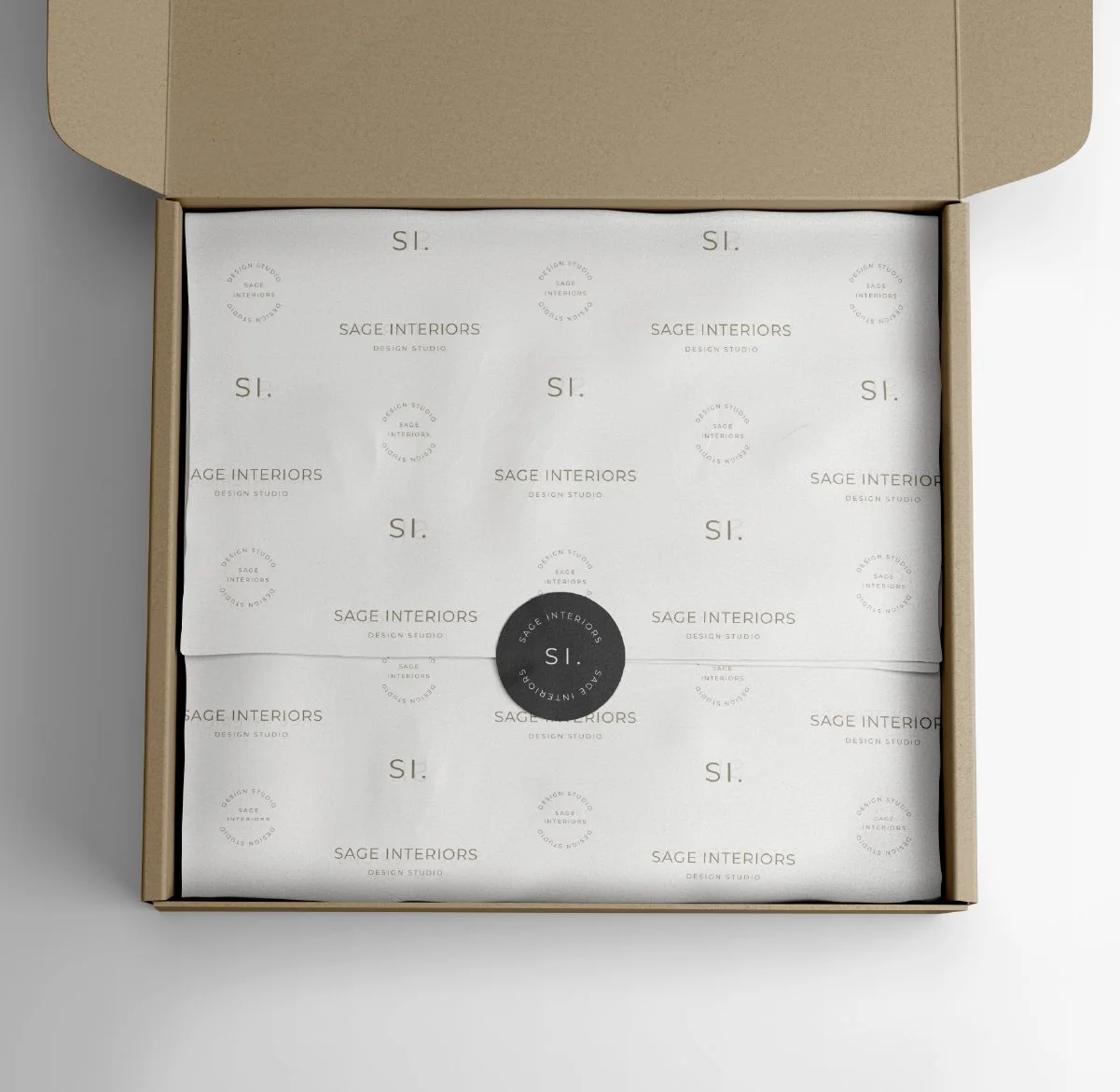
![Open cardboard box containing branded tissue paper with 'Sage Interiors' logo and packaging sticker.]()
The Minimalist
-
![]()
The Curator
-
![]()
The Minimalist
-
![]()
The Curator
-
![]()
The Muse
-
![]()
The Muse
-
![]()
The Muse
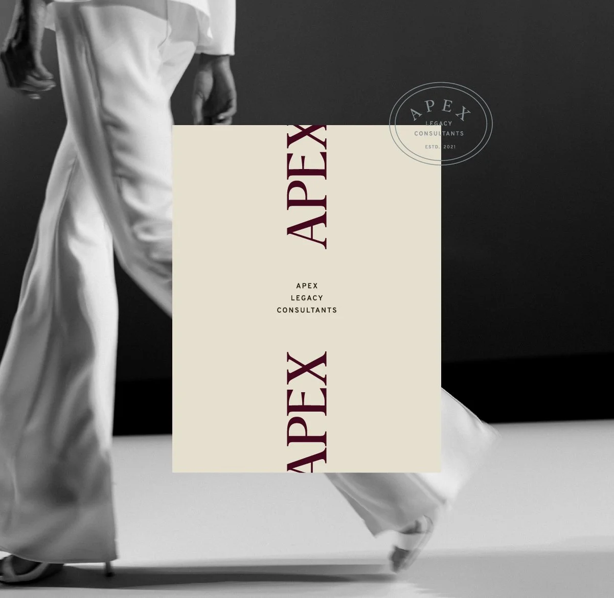
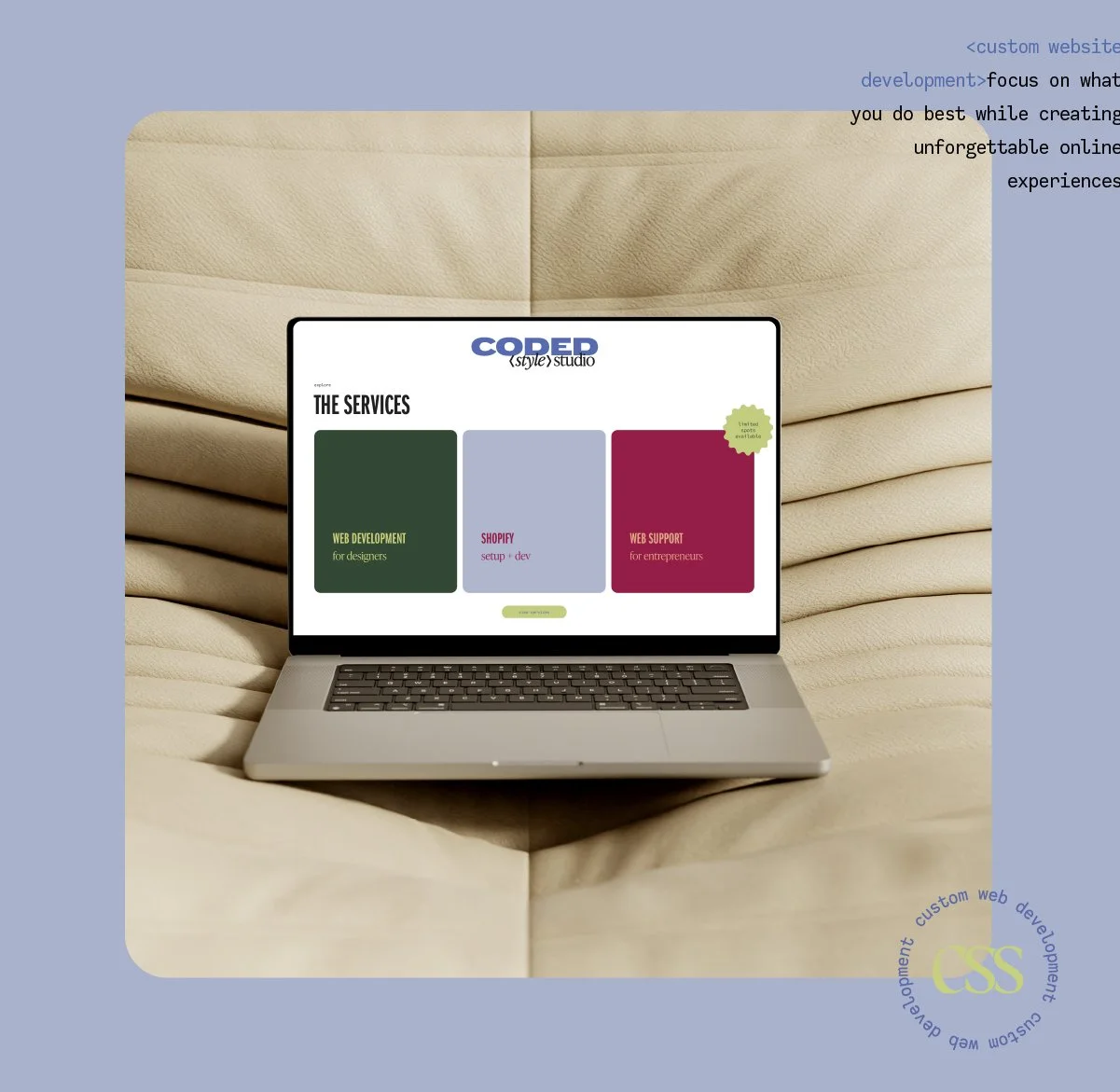
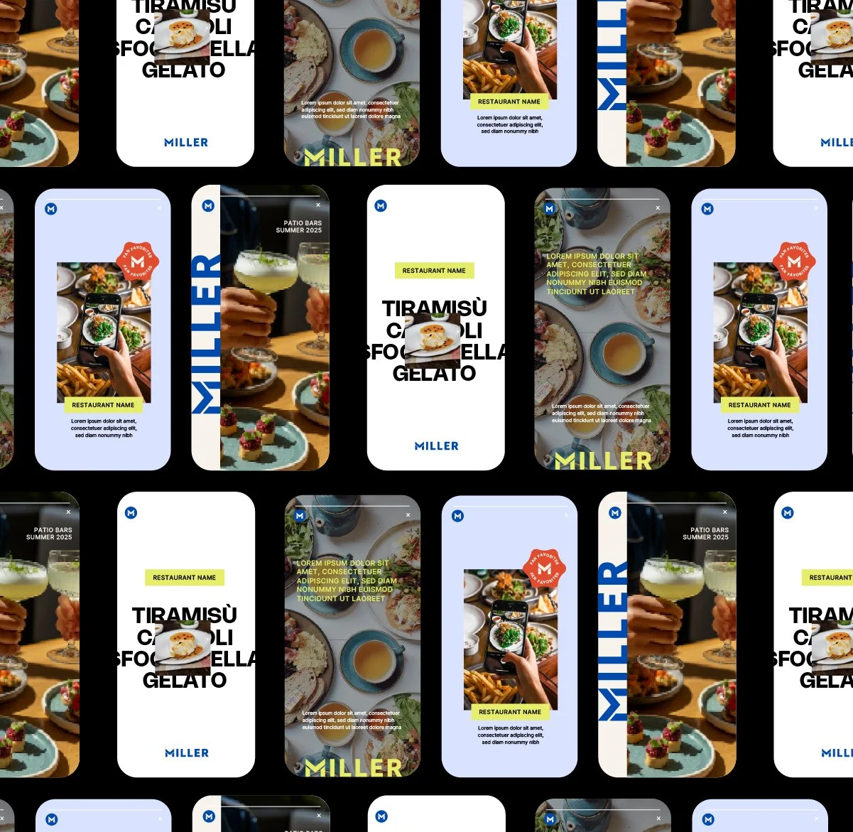
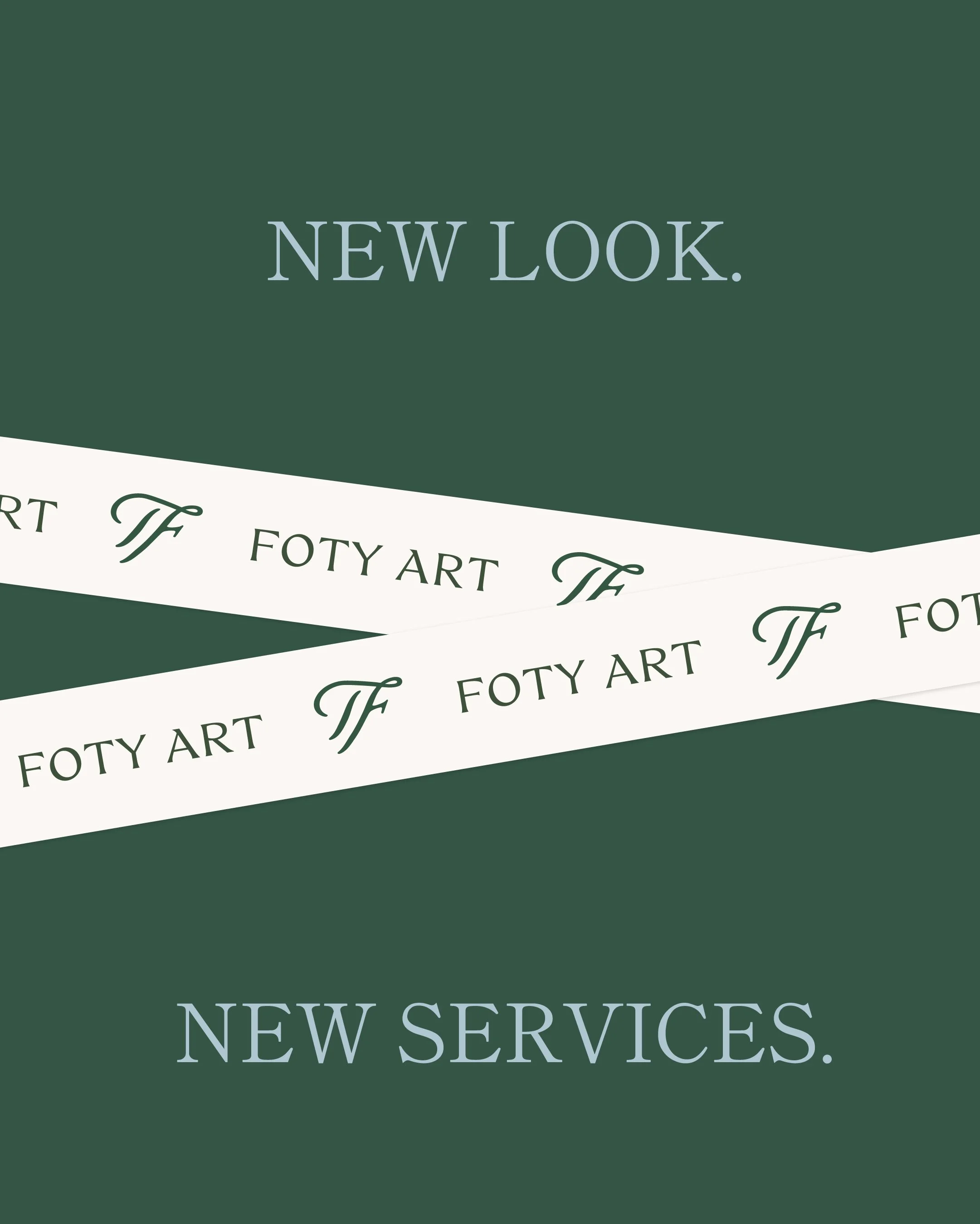
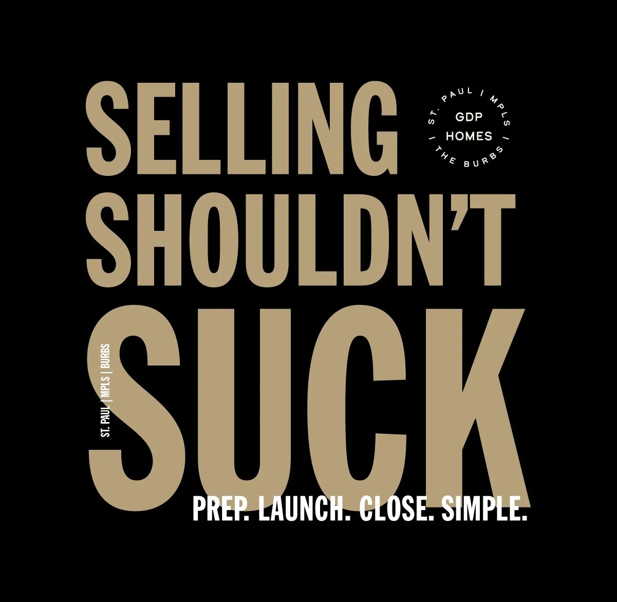
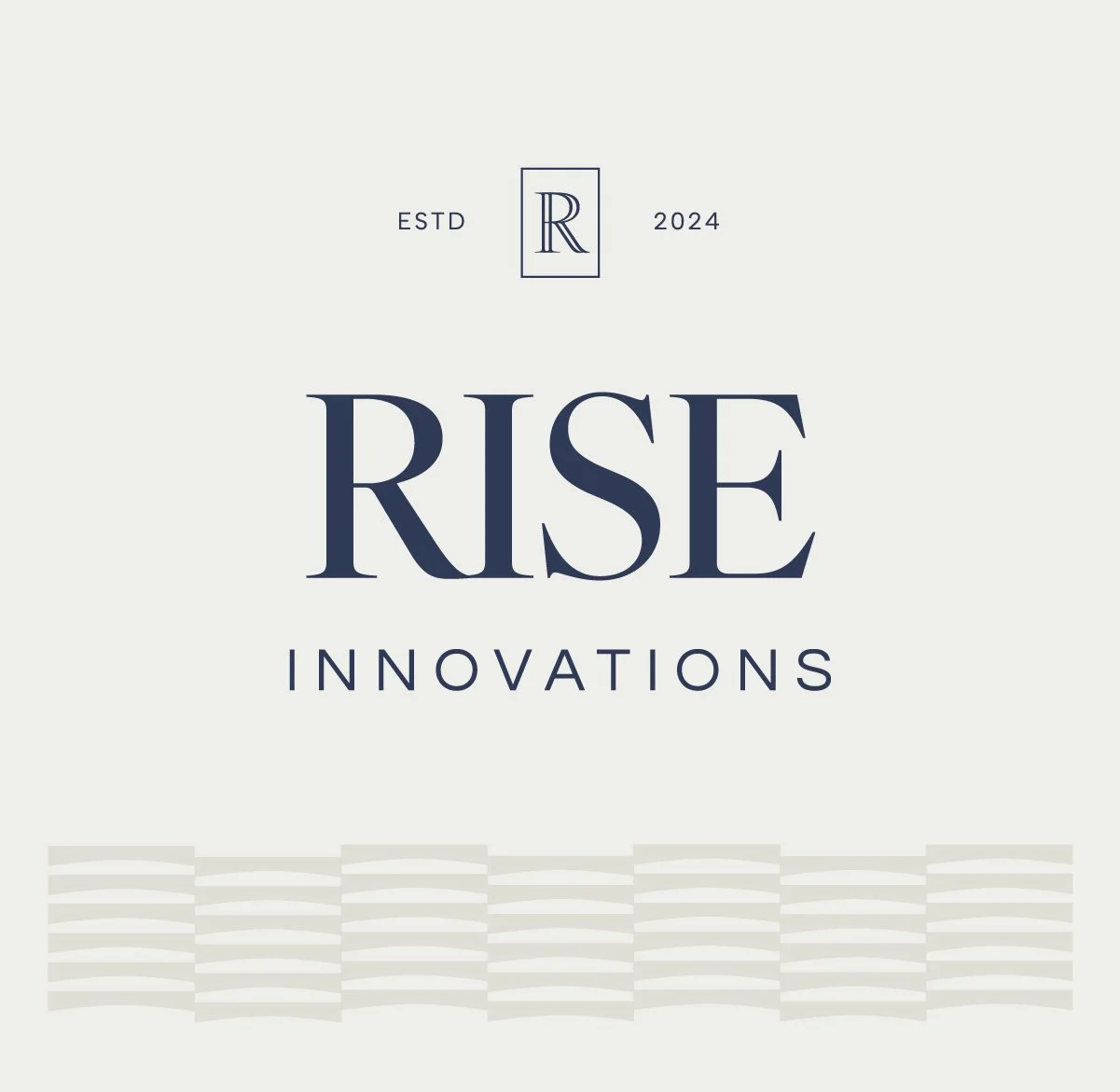

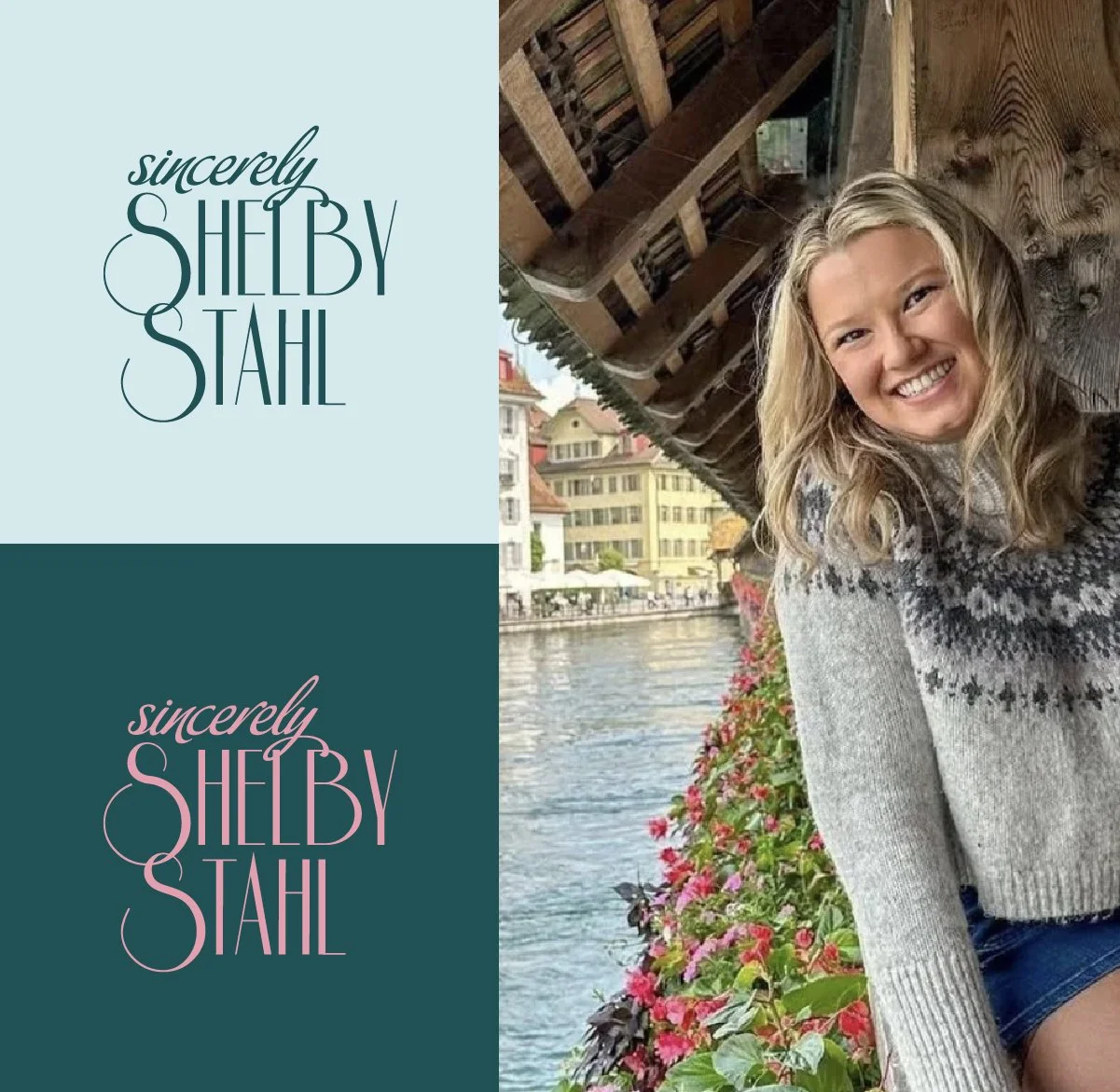
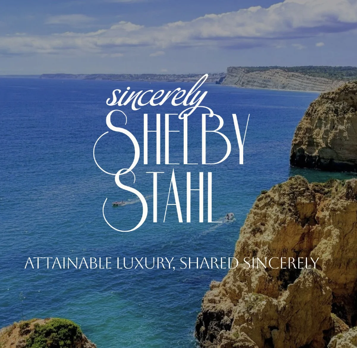
Curated branding. Customized by you.
These aren’t templates or “pick a vibe” kits. Each direction is intentionally built with strategic color stories, refined type pairings, and visual identity systems that already work together. You pick the direction that feels most aligned. We customize it into a brand that’s unmistakably you.
It’s fast. It’s focused. It’s designer-guided. And it finally gives your business a brand that matches the level you’re playing at. If you’re ready to look the part while you grow into your next chapter, this is for YOU.
The Brand Edit
What’s included:
Curated logo suite (primary wordmark and submark)
Color palette
Typography suite
A refined, cohesive aesthetic that supports your growth
Launch graphics to promote your new look
Final files for print and digital usage
Mini brand guide for using your new identity with ease
$3,200
Mābella // The Minimalist
Still have questions?
-
Each direction is a starting foundation, not a template. You’re not picking a kit off a shelf. I customize the logo, colors, and typography specifically to your business, so what you end up with is built around you, not just skinned to look like it is.
-
If what’s missing is deeper than your visuals — your positioning, your messaging, the strategy behind how your brand shows up — that’s a sign you’re ready for the full custom branding experience instead, and I’m happy to talk through which one fits where you are.
-
Yes! Within the curated direction you select, you’ll be able to make refinements to logos, colors, typography, and small design details to make the brand feel more aligned with your vision. The main part of your brand that will stay similar is the overall aesthetic vibe of the direction you choose.
-
Your Brand Edit includes one focused refinement round to fine-tune your chosen direction. This covers small adjustments like color tweaks, spacing, and typography refinements. More rounds of revisions can be added at an additional cost (depending on scope of the revision request).
-
Brand Edits are completed in 5 business days and final files are sent within one week of final approval. I’ll share a detailed timeline during onboarding so you always know what’s coming next.
-
You’ll get everything you need to start using your new brand immediately: logo files for print and digital usage, curated color palette, typography suite and font files, and a mini brand guide to help you apply everything confidently.
-
Yes! If you want to expand your visuals beyond the Brand Edit, a Design Day is the perfect next step after your project wraps. We can build out custom collateral like social templates, business cards, print collateral, or anything else you need to elevate your brand across every touchpoint. Reach out for more information.
-
Yes, every project is split into two payments automatically. The first payment is to book your spot and the second is paid before the final files are sent over.
Operations Office Hours // The Muse

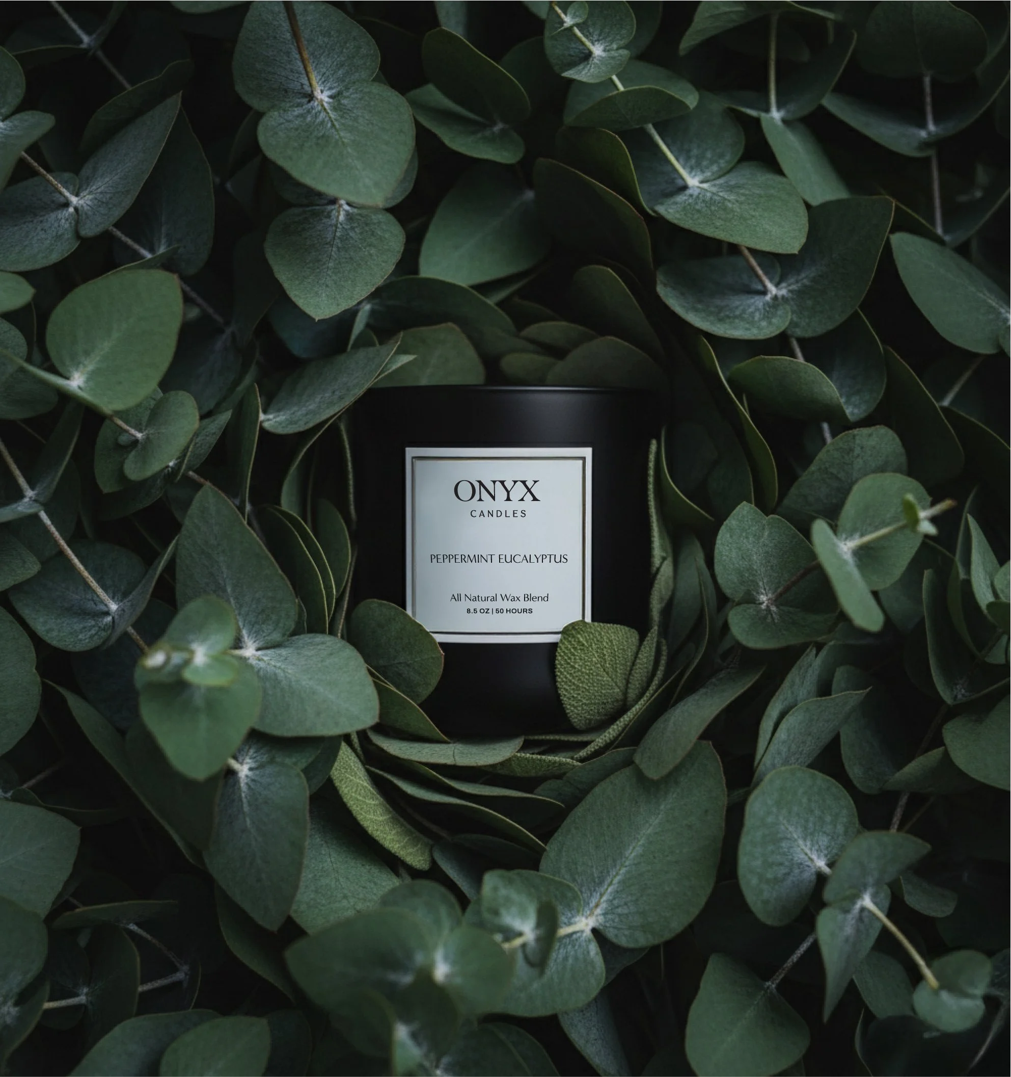
Onyx Candles // The Curator
Let’s get your visuals caught up to your business
I only take a small number of Edits each month alongside full brand projects, so if your visuals have been on the “should really fix that” list for a while, this is a good time to grab a spot.