Section Styles sticky
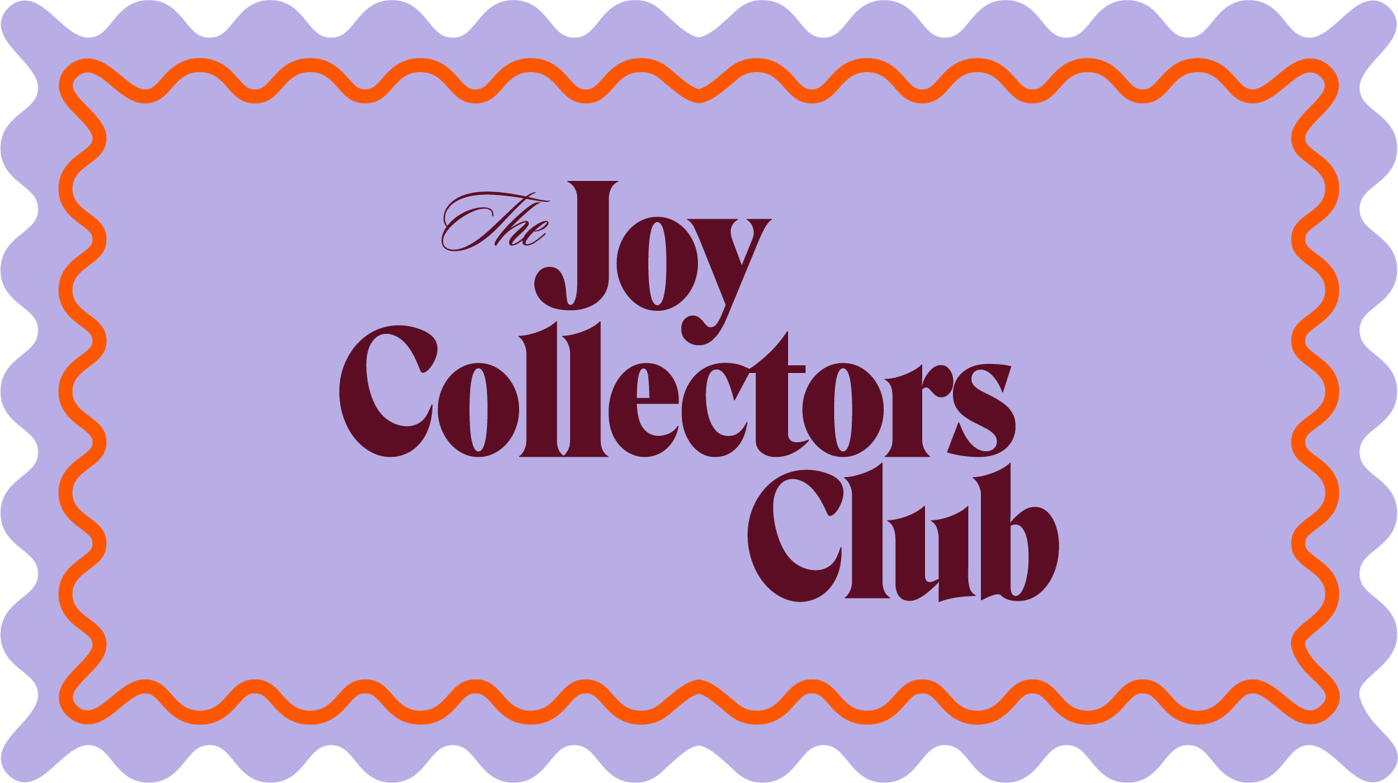
The Joy Collectors Club
Brand Identity
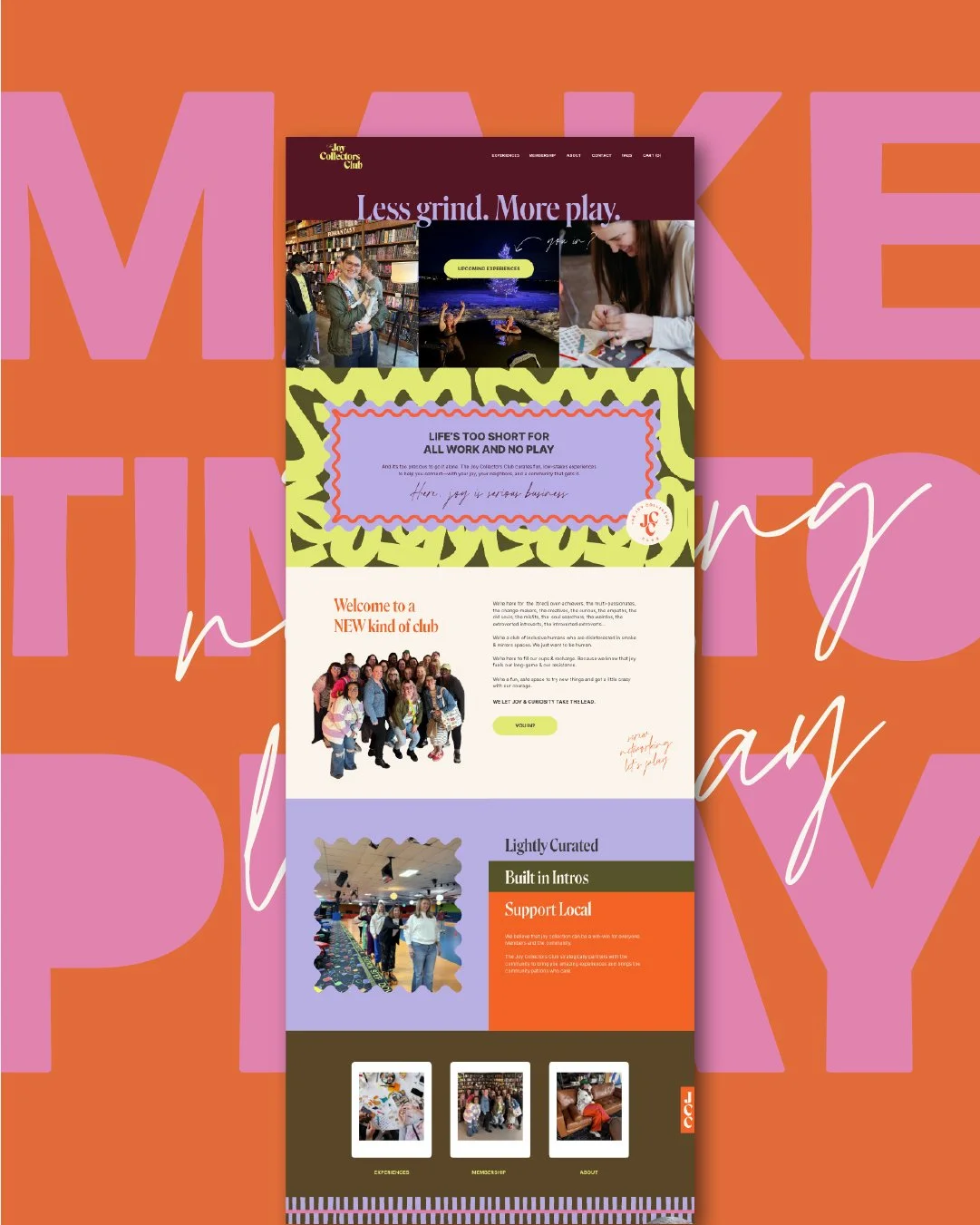
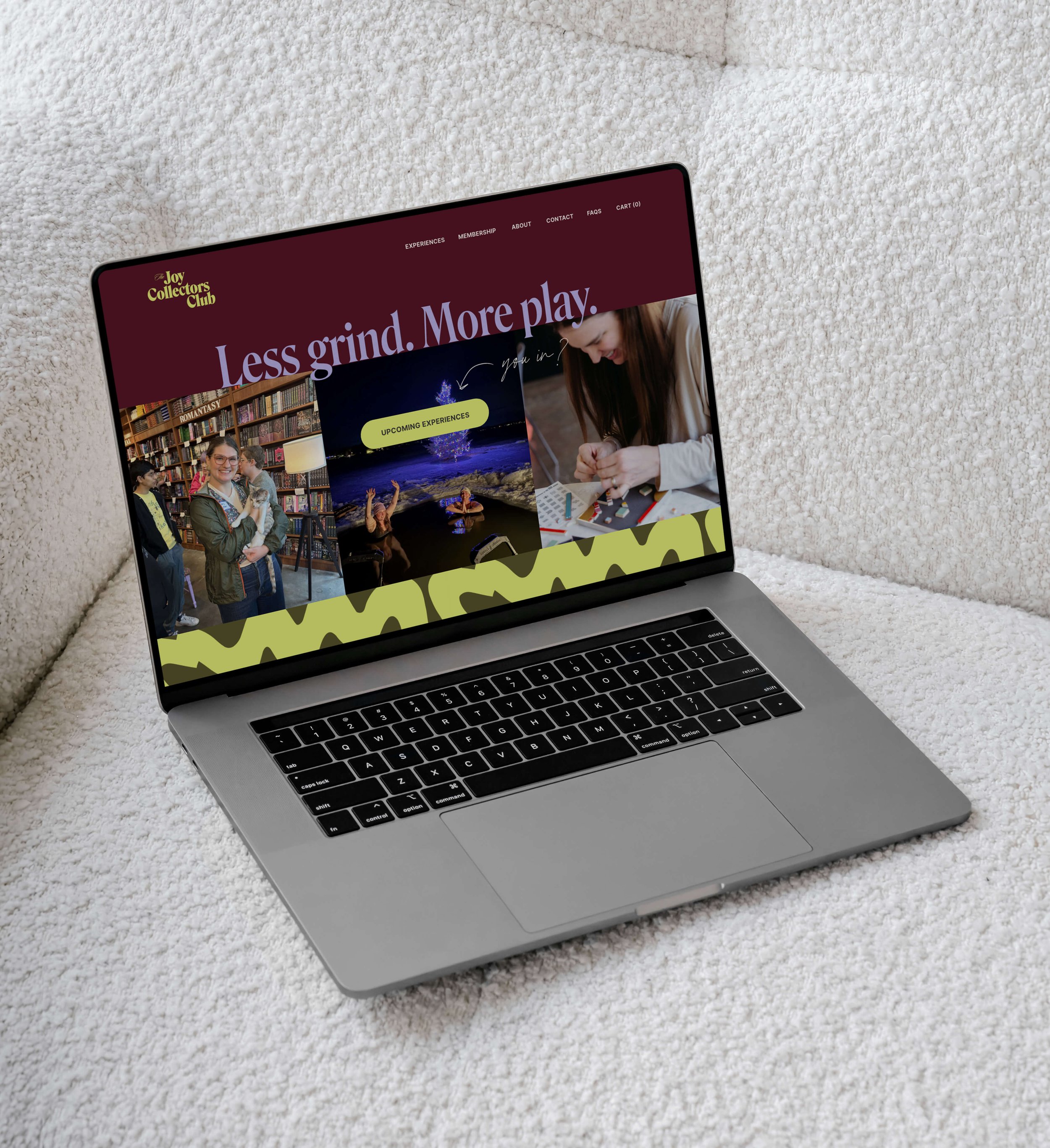
Website Design + Development
The Joy Collectors Club was created as an extension of Andrea’s coaching business. But with more edge, more color, and a little rebellion.
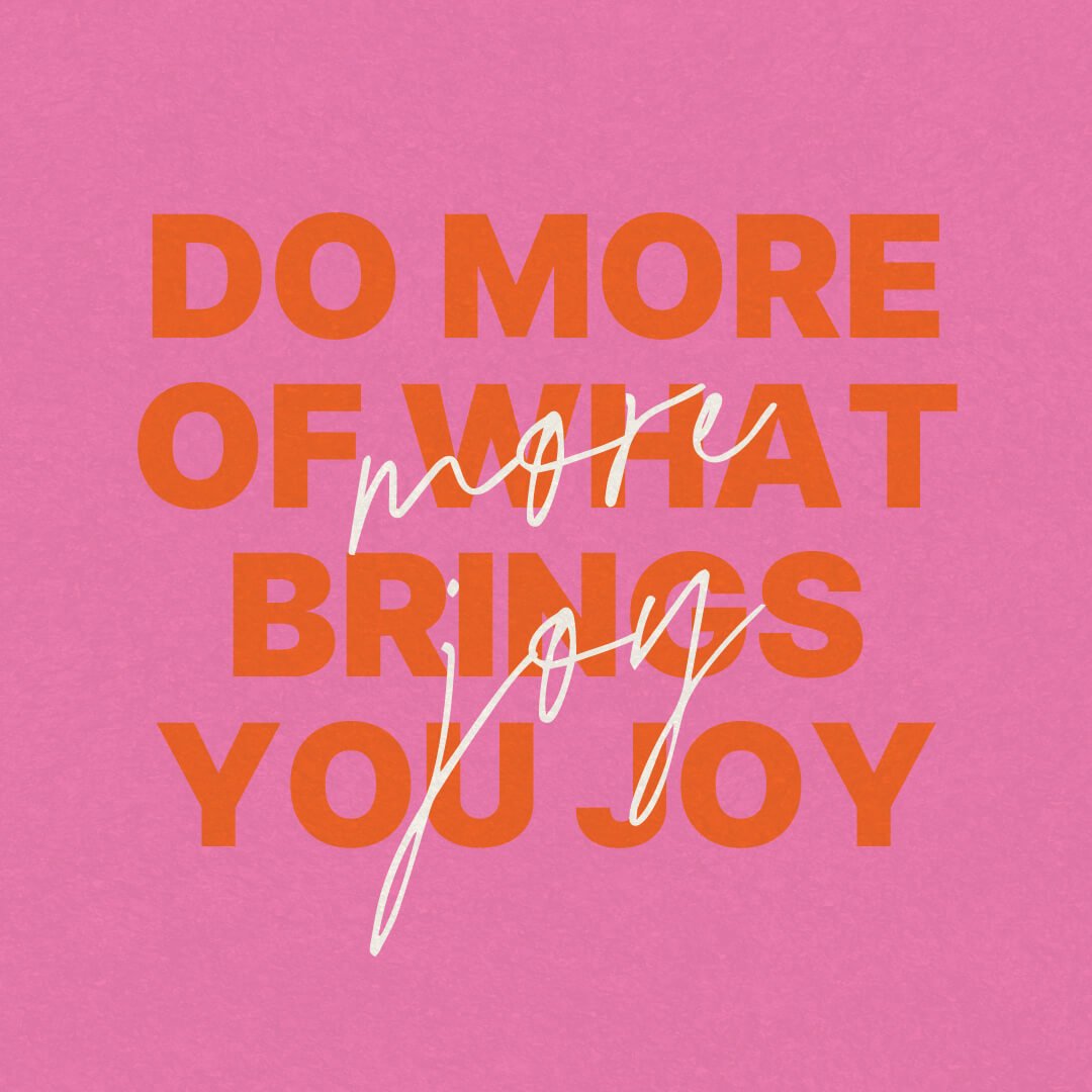
This wasn’t meant to feel polished or restrained. It needed to feel alive. A space that flips the script on how we connect, slow down, and experience joy through curated, low-pressure experiences that invite people to show up fully and without pretense.
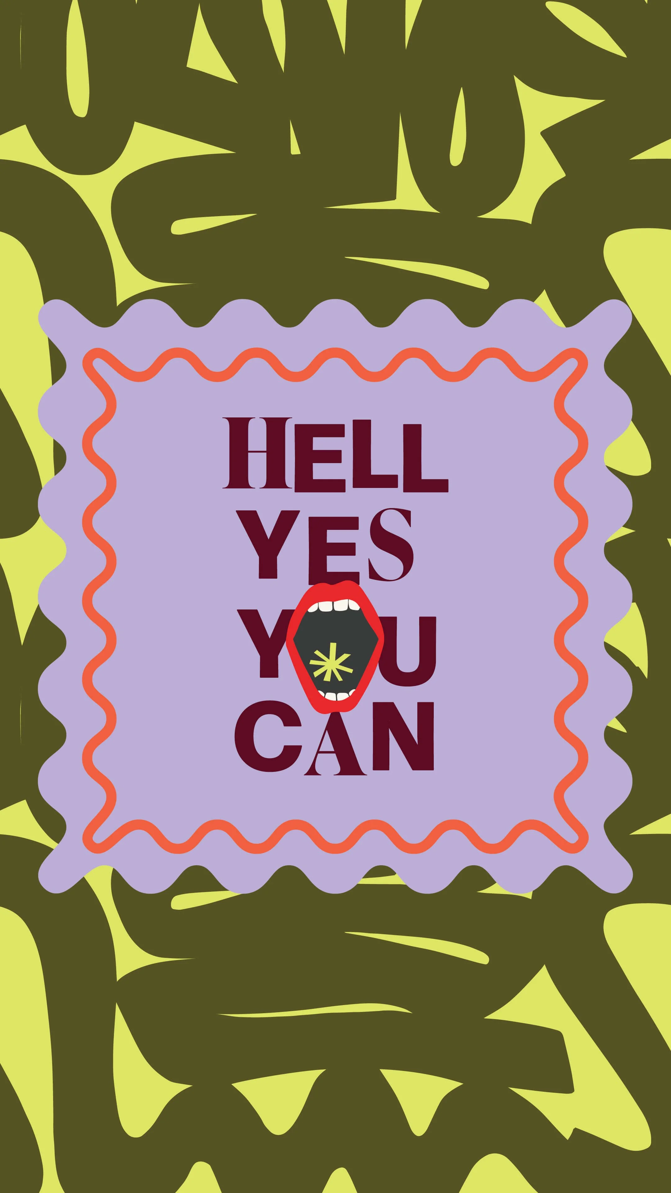
The brand had to hold contrast. Playful yet grounded. High-energy but deeply considered. Bold enough to stand on its own, while still feeling aligned with the heart of her mission.
The results
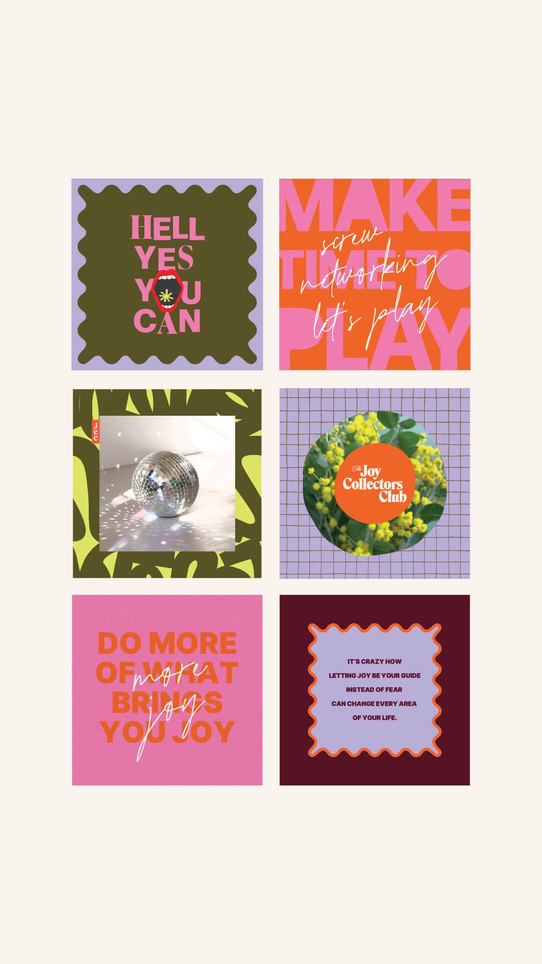
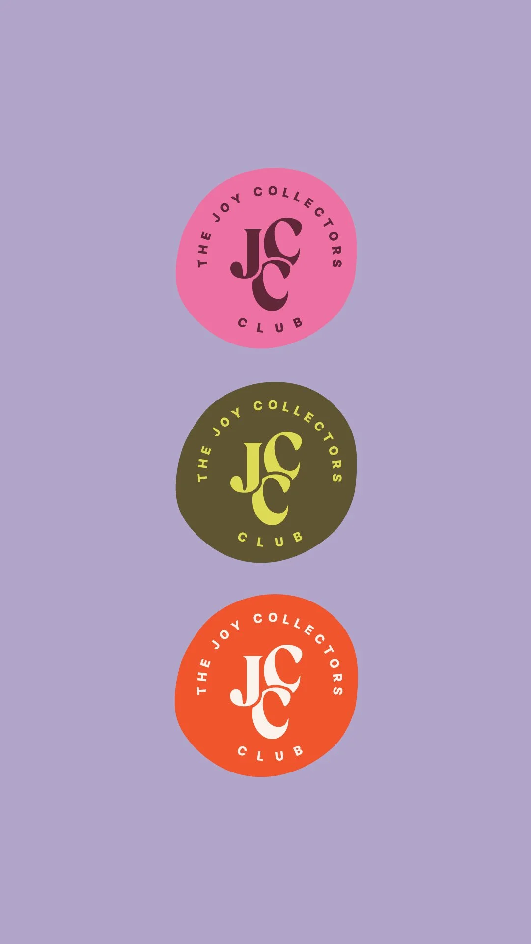
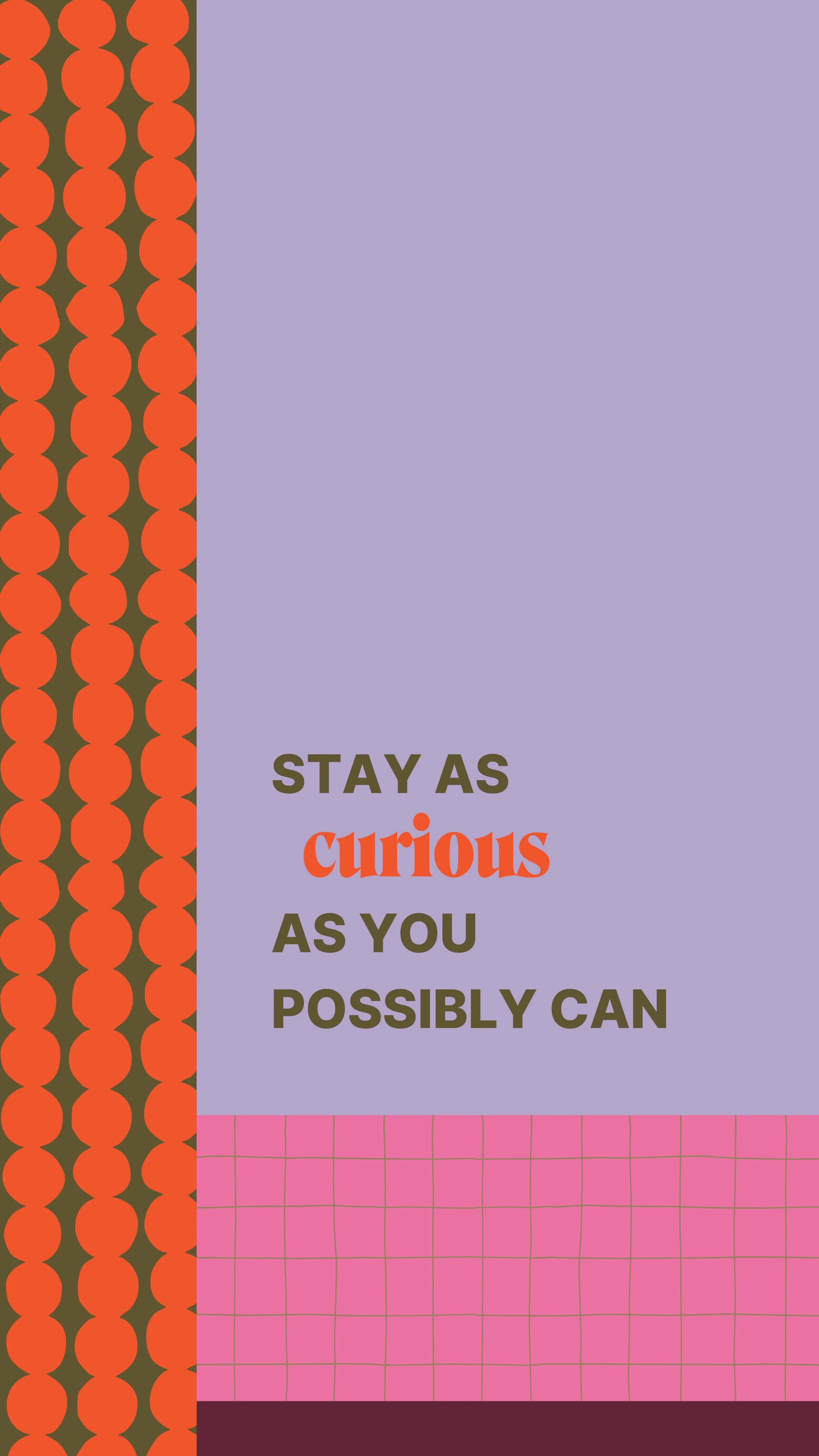
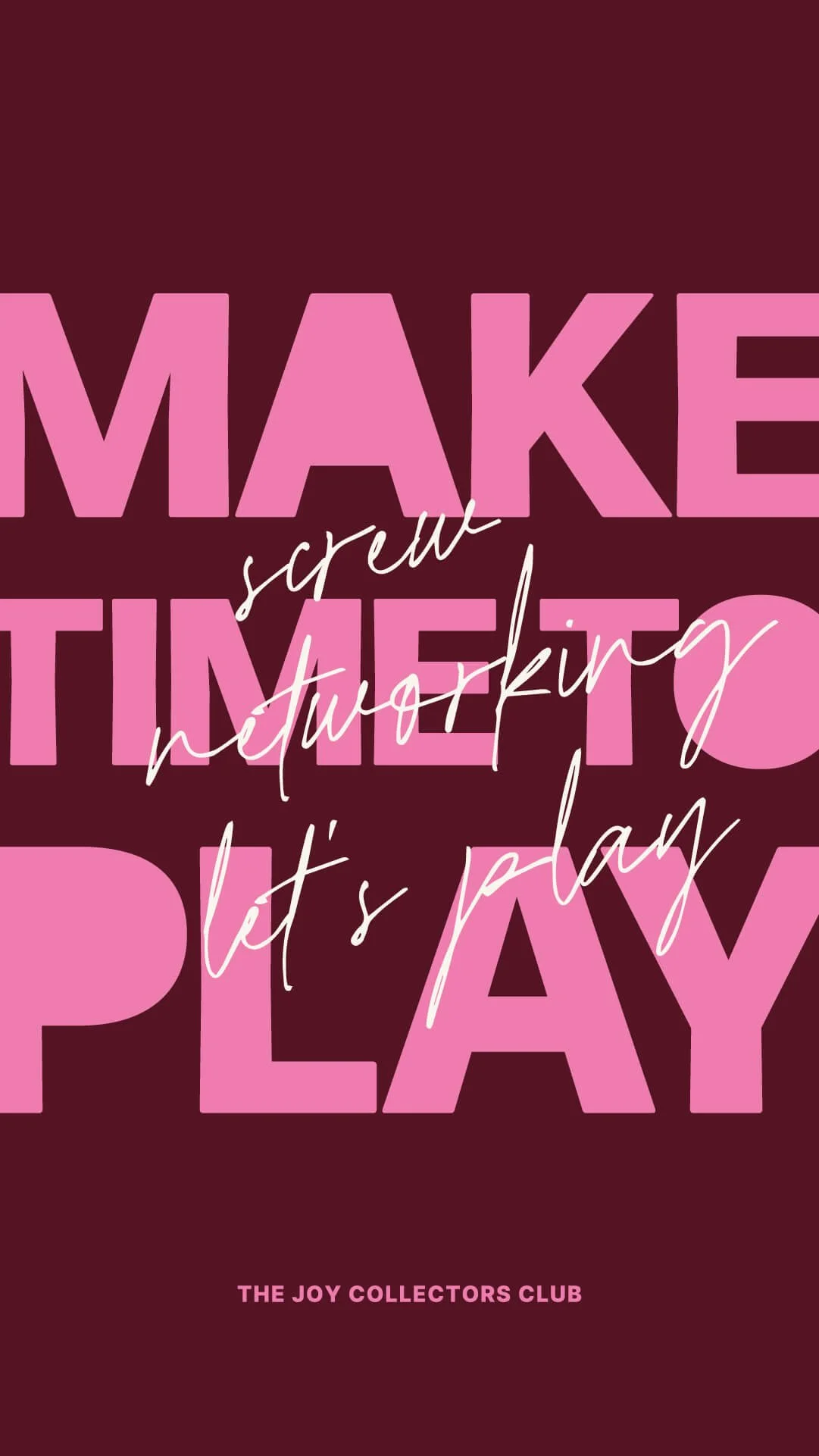
A bold, layered brand identity that breaks the rules. On purpose.
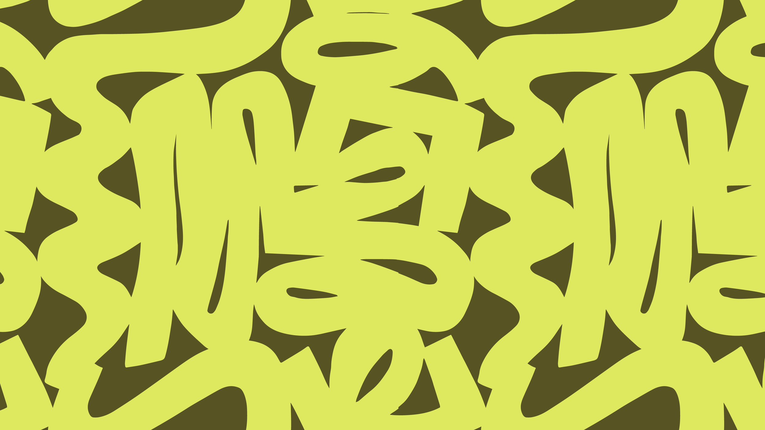
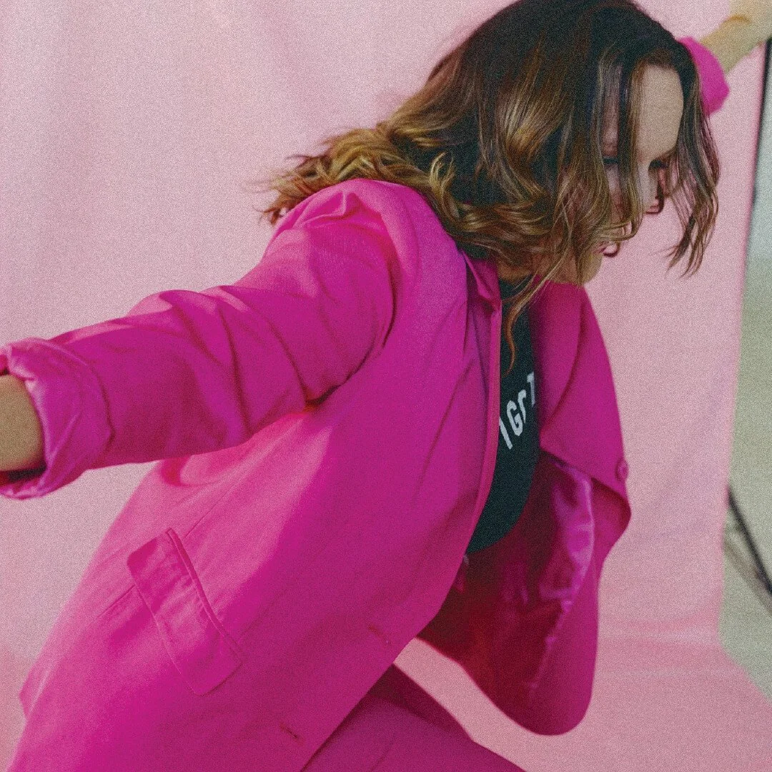
Electric oranges, punchy pinks, neon accents, and deep, moody tones create a visual world that feels vibrant, expressive, and impossible to ignore. Layered patterns add texture and movement, giving the brand depth and dimension while holding space for its playful, rebellious spirit and the grittier side of feeling deeply.
The result is a brand that feels immersive and magnetic. One that positions joy as something intentional, personal, and worth making space for, while building a community that craves real connection, creative expression, and a little more play in their lives.
Sheena is a true MASTERMIND. She “got it” and “got me” immediately
She eloquently encapsulated my vision for my work. Couldn’t be more thrilled!!!!